top of page

ASAI | Strategic Brand Identity & Campaign
Launching a non-dairy yogurt brand in a crowded wellness market, without looking like every other plant-based product.
Industry
Type
Status
Year
Food & Beverage
Brand Identity & Campaign
Self-Initiated Case Study
2022

01 | the problem
A crowded category where everyone looks the same
The non-dairy yogurt market is dominated by Chobani, Siggi's, Fage, and Stonyfield, and despite their differences, they share one visual language: earthy tones, minimalist layouts, handcrafted aesthetics, and clean-label imagery. The category had become visually predictable.

ASAI needed to enter this saturated space with an identity bold enough to stop a shopper mid-aisle without alienating the health-conscious consumer it was also trying to reach.
The white space
No brand in the non-dairy segment was occupying a bold, flavor-forward, premium-yet-playful position. That gap was ASAI's opportunity.
02 | the strategy
Intentional divergence from category norms
After a competitive audit of 9 major brands (Chobani, Fage, Oikos, Siggi's, Stonyfield, Activia, Dannon, Yoplait, YoCrunch), mapping their visual systems, audiences, and positioning gaps, one core insight emerged:
"Better for you doesn't have to look or feel like a sacrifice."
brand pillars established:
Premium
High-Quality
Guilt-Free
Flavor-Forward
Bold Visual Identity

Positioning territory
ASAI would own the intersection of indulgence and wellness, a tension most brands in the category deliberately avoid. The visual direction would entirely diverge from soft greens, yellows, and whites.
03 | the design system
Every visual decision connected to the strategy
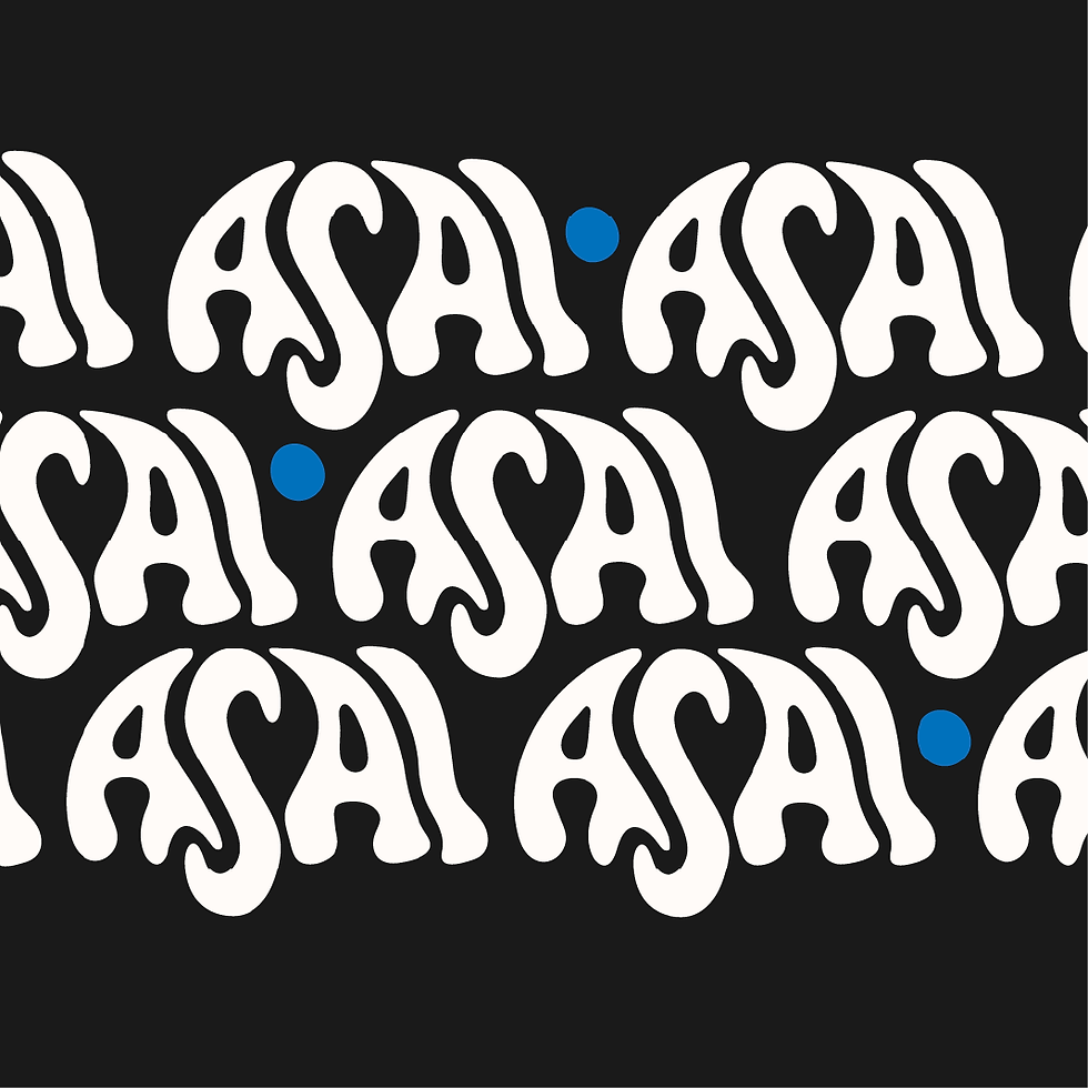
Custom dripping logotype
Communicates indulgence and energy. Paired with clean modern typography for balance and readability. Extended into brand patterns for recognition across all touchpoints.
Color system — black, crème, rich flavor tones
A deliberate departure from competitors' soft greens, yellows, and whites. Each flavor variant expresses its own story through color while maintaining system cohesion.
Photography art direction
High-contrast, rich-toned visuals emphasizing texture and decadence, positioning ASAI more like a luxury food item than a functional health supplement.
Brand asset system
Heart icon derived from the logo, brand patterns, full visual identity system, ready for packaging, digital, and marketing channels.

Logo / dripping logotype

Color palette — black, crème, flavor tones
Heart icon + brand patterns
04 | Full brand system
Packaging, social, and digital — delivered in 8 weeks

Social media application

product packaging

Digital ad creative


05 | the outcome
The market confirmed the strategic bet
ASAI's brand identity was completed within the 8-week window, a full system ready for packaging production and market launch. When shared on social media on an account with under 100 followers, the results validated the core strategy.
10–20%
Engagement rate on launch
1–3%
Industry average for comparable accounts
8 wks
Full system delivered
9
Competitor brands audited
Strategic conclusion
Intentional divergence from category norms is not a risk; it's a competitive advantage. A bold, premium, flavor-forward non-dairy brand has a real appetite in the market.
Other Projects


bottom of page