top of page

HIBRET | Strategic Brand Identity
Seattle's Ethiopian & East African diaspora had no high-end bakery café to call their own. Hibret was built to change that, a brand that honors cultural heritage without losing its modern edge.
Industry
Type
Status
Year
Food & Beverage
Brand Identity
Self-Initiated Case Study
2025

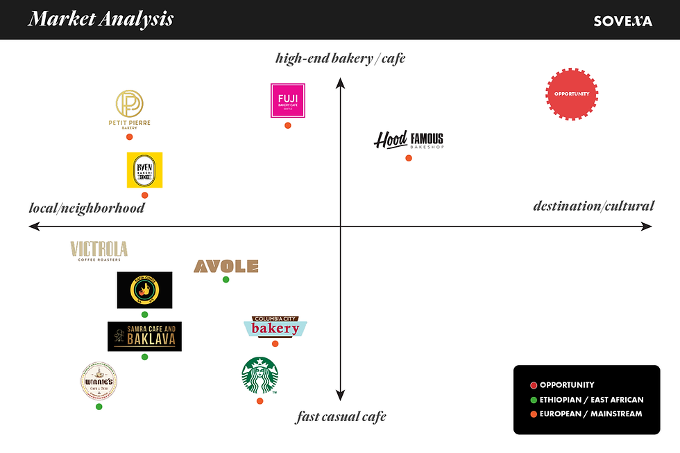
01 | the problem
A cultural and market gap hiding in plain sight
Seattle has a significant and growing Ethiopian diaspora community, with deep ties to food, coffee ceremony traditions, and the flavors of home. Yet the city's café and bakery scene had nothing designed specifically for them at a high level.
Existing Ethiopian food businesses were either informal, under-branded, or positioned for purely functional dining; none felt curated, intentional, or designed to compete with Seattle's broader specialty coffee and artisan bakery scene.
Primary audience
Seattle's Ethiopian & East African diaspora, a community seeking a premium cultural home in the city's café and bakery scene.
Secondary audience
Seattle's design-aware, café-culture consumers are open to a new, curated cultural experience
02 | the strategy
Honor heritage without feeling dated. Feel modern without losing soul.
The core strategic challenge was nuance: build a brand that works for two distinct audiences simultaneously without compromising for either. The solution started with the name.
A brand that the Ethiopian diaspora could feel proud of while making the experience accessible and inviting to all of Seattle.
Brand naming insight
Hibret means unity, togetherness, and collaboration in Amharic. The name anchored the entire brand strategy in themes of community, belonging, and shared experience that resonate with both audiences without requiring cultural translation.
brand pillars established:
Collaboration
Union
Synergy
Community
Cultural Pride
Modern Luxury
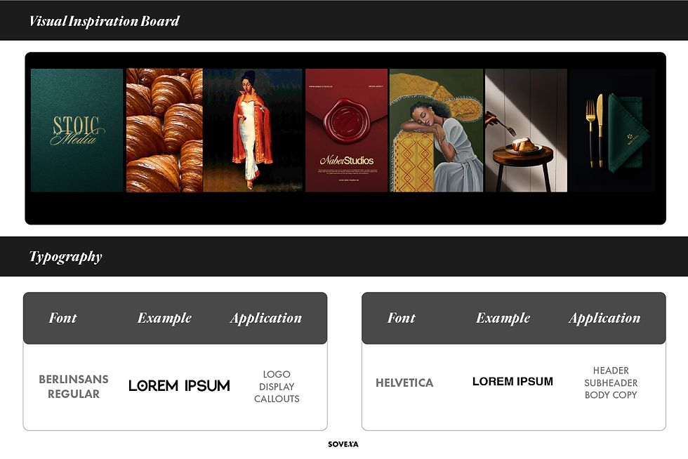
03 | the design system
Cultural authenticity expressed through contemporary craft
Logo suite
Modern typeface with subtle cultural flair, balancing refinement with warmth. Deliberately avoided both sterile minimalism and overly decorative aesthetics that can feel dated.
Custom textile pattern
Inspired by high-end luxury brand patterns and East African textiles, an authentic, ownable cultural asset that adds storytelling depth across packaging and collateral without feeling costumey or tokenistic.
Color palette — earth tones elevated
Deep greens, reds, white, and black referencing Ethiopian cultural symbolism. Handled with restraint to push the palette into a sophisticated, contemporary register rather than a literal flag reference.
Full touchpoint system
Packaging, menu design, social media templates, and signage, every physical and digital touchpoint is designed for cohesion from storefront to table.

brand patterns

Logo suite

Color palette
04 | Full brand system
Packaging, social, and digital — delivered in 8 weeks

Photography direction

product packaging
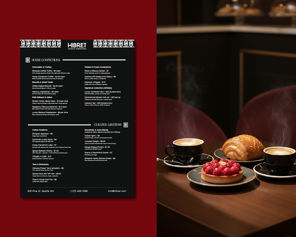
menu design


05 | the outcome
A first-mover brand built for a real, underserved market
The complete Hibret brand system was delivered within 6 weeks: logo suite, packaging, menu, patterns, and marketing collateral, all ready for real-world application.
6 wks
Full system delivered
2
Distinct audiences served by one brand
6+
Brand asset categories delivered
Strategic conclusion
Hibret is positioned to be not just a café, but a cultural landmark, a place the Ethiopian & East African community can call their own, and that Seattle's broader food scene would be proud to embrace. The first-mover opportunity in this space remains wide open.
Other Projects


bottom of page